Here are the print screens of me making the production logo on Adobe After Affects.
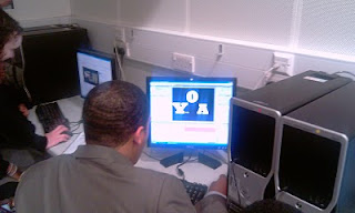
 In this screen shot i am creating the letters of the production logo.
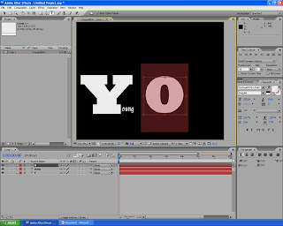
 In this screen shot i am trying to find the best postioning of the letters and what colours to use.
 In this screen shot i have added what the YOA stands for but i don't think that it looks good enough
 In this screen print i ahev changed the arrangement becuase i thought that the arrangement before did not look like a production logo.
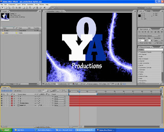 In this screen print i have added effects to make the production logo look more attractive and presentable.
No comments:
Post a Comment