
Wednesday, 17 February 2010


Tuesday, 16 February 2010
INFLUENCES
 Kidulthood
 was a major influence on our short film, there are very few successful films which fitted into our genre and theme, our film was based on drugs and violence and so was Kidlulthood, this film inspired us to create a short film which also gave a representation of youths in today's society, it is fair to say that most films of this particular genre represent young people in a negative way, we were out to do the complete opposite, yes we did portray youths at the start in a way which could be deemed negative, however, in the end we turned the story around completely and sent out a positive message the the viewers of this film.
Other influnces:
- Adulthood
- Skins
- Boyz In Da Hood
- Bullet Boy
Monday, 15 February 2010
FEEDBACK FROM ROUCH CUT
On Thursday 18th March 2010 we showed our opening to our class mates.
This is the feedback we got:
This is the feedback we got:
- interesting and good
- attracts audiences
- excellent soundtrack, it goes with the timing of the titles
- titles look professional
- good effect on the dancing adds to the drunk effect
- the "wasn't always like this" needs to be recorded again
- some scenes are too dark and needs to be re-shot
- cannot tell the narrative
- make the main title last longer
- make drugs last longer
we will be taking this feedback and using it to improve our opening.
Improvements we are making:
- taking out the wasn't always like this or re-doing it
- re-shooting today the dark scenes
- adding extra shots to the drug scene to make it longer
- making the titles last longer
we wanted to make the audience not know the narrative so that they can try to just what is going to happen in the film and so that they can try to link the characters together. we mainly wanted the audience not to know the narrative so that they would be attracted and interested to find out what happens in the film.
Estate Of Mind Rough Cut from Jemma Goulds on Vimeo.
PRODUCTION LOGO
I was given the task of making the production logo for the opening. 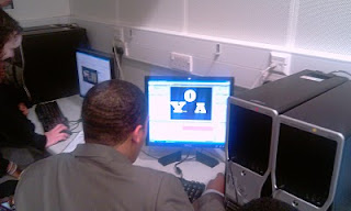
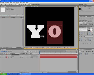 In this screen shot i am creating the letters of the production logo.
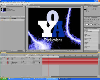 In this screen print i have added effects to make the production logo look more attractive and presentable.
Here are the print screens of me making the production logo on Adobe After Affects.
In this screen shot i am creating the letters of the production logo. In this screen shot i am trying to find the best postioning of the letters and what colours to use.
 In this screen shot i have added what the YOA stands for but i don't think that it looks good enough
 In this screen print i ahev changed the arrangement becuase i thought that the arrangement before did not look like a production logo.
In this screen print i have added effects to make the production logo look more attractive and presentable.Sunday, 14 February 2010
TITLES
Terry was given the task of making the titles:
Here are screen shots of him making it:
Here are screen shots of him making it:

In this screen print is showing the movement of the letter. This was done on Adobe After Affects. The background is like smoke red and grey, the red is to symbolize the danger and the grey is to smbolize the mysteroius effect.

MAIN TITLE MAKING
We each started making our own main title and we was going to see which one most suited the film.
We was using Adobe After Effects to make the titles and we would import it into Adobe Premier Pro where the opening was stored
This is the making of my titles.

i was adding effects to make the titles look better and experimenting with the colours

My title was not chosen but at lest i was able to learn how to use the program.
We was using Adobe After Effects to make the titles and we would import it into Adobe Premier Pro where the opening was stored
This is the making of my titles.
i was adding effects to make the titles look better and experimenting with the colours

My title was not chosen but at lest i was able to learn how to use the program.
Subscribe to:
Posts (Atom)